Most companies approach branded t-shirts for employees the same way. They take their logo, hand it to a supplier, and ask for it to be printed on the front of a shirt. The shirts arrive, employees say thank you, and within a week the majority of them are folded in a drawer. A few end up as gardening clothes. Almost none are worn anywhere that matters for the brand. If this sounds familiar, the problem is not the shirt — it is the thinking behind it.
The Real Reason Company T-Shirts End Up in a Drawer
Nobody wants to be a walking advertisement. That is the simple truth behind why most corporate t-shirts go unworn. When you print your company logo large across the front of a shirt and give it to an employee, you are asking them to spend their personal time — at the weekend, at dinner, at the gym — promoting your brand for free. Most people, quite reasonably, would rather not do that.
It is not that employees dislike the company. It is that wearing a shirt that is visibly and entirely about the employer feels like an extension of work rather than an expression of who they are. Clothing is personal. What people choose to wear when they are not obligated to wear anything says something about their taste, their values and their identity. A shirt with a company logo says nothing about any of those things — it says only that the person works somewhere.
The paradox is that the more aggressively branded the shirt, the less likely it is to leave the house. And a shirt that never leaves the house is not branding — it is just an expense.
The Design Principle That Changes Everything
The question most companies ask when designing employee t-shirts is: how do we get our brand on this shirt? The question they should be asking is: why would someone genuinely want to wear this?
When you design a shirt that people actually want to wear, the branding takes care of itself. A shirt worn on a Saturday afternoon in a busy neighbourhood generates more meaningful brand impressions than a shirt sitting in a drawer generates in a year. The goal is not a shirt that carries your logo. The goal is a shirt that carries your logo somewhere interesting.
The good news is that getting there does not require an enormous design budget or a completely different approach to how you think about the brand. It requires a shift in priority: put the wearer first, and build the branding around that.
“The best company t-shirt is one where an employee’s friend says ‘I like that shirt’ before they notice whose name is on it.”
Use Your Company Culture as the Design
Every company has an internal culture — phrases that get used in meetings, running jokes that everyone understands, references to the company’s founding story or early days. Most companies keep this culture entirely invisible on their branded clothing. That is a missed opportunity.
An internal cultural reference on a t-shirt does something that a logo cannot: it makes the wearer feel like an insider. It signals membership of something specific and personal rather than just employment at a company. When a shirt says something that only your team would understand — a phrase from your values document, a reference to a memorable moment in company history, the inside language of your industry done with wit — employees do not experience it as branded clothing. They experience it as a piece of their identity.
Think about the phrases your team actually uses. A technology company whose engineers talk about “shipping” something could build a beautiful typographic design around that word. A marketing agency whose team talks about “finding the signal” has a design concept already. A logistics company that prides itself on delivery could work with the literal idea of movement and arrival. The starting point is always the same: what do people in your company say that nobody outside it would fully understand?
This approach works because it rewards the wearer. When someone compliments the shirt and the employee gets to explain the reference, that is a brand moment — a genuine, personal conversation about what the company stands for. That conversation is worth more than a hundred passive logo sightings.
Typography That Does the Work
A well-executed typographic design can be the entire concept of a company t-shirt, and it will almost always outperform a logo-on-blank approach in terms of wearability. The reason is that strong typography looks like it belongs in a fashion context — it references the design language of brands people choose to buy from, not the language of promotional merchandise.
There are several directions a typographic approach can take. Your company’s founding year set in a striking typeface, styled like a vintage garment, gives the shirt a heritage quality that makes it feel considered rather than corporate. Your company name treated as a design object — broken across lines, oversized, paired with a city name or a short phrase — produces something that looks intentional and distinctive. A single word from your brand values, chosen for its visual strength and set beautifully, can carry a shirt entirely on its own.
The key is that typography-led design divorces the shirt from the feeling of a promotional item. A shirt that says your company name in a generic brand font, centered on the chest, looks like merchandise. A shirt that uses your company name as the raw material for a genuinely interesting design looks like something you might find in a boutique. Same words, completely different result.
Illustration That Tells Your Story Without Saying It
Custom illustration is one of the most powerful tools available for branded employee apparel, and one of the most underused. A good illustration communicates what a company does, believes in or stands for without a single word — and it does so in a way that is visually engaging enough that people want to wear it.
The starting point is not “what does our logo look like as an illustration.” It is “what image would capture what we actually do, in a way that is interesting to look at?” A software company might commission an illustration that represents the flow of data or the architecture of a network in an abstract, beautiful way. A food brand might commission a detailed botanical illustration of the ingredients they are most proud of. A construction company might commission an aerial illustration of a city being built. None of these are logos. All of them tell the brand’s story more richly than a logo does.
Illustration also ages better than logo-led design. A shirt with a well-executed illustration becomes more interesting over time, in the same way that a vintage band tee or a travel souvenir becomes more interesting. It develops a story. People keep illustrated shirts in ways they do not keep promotional ones.
If budget allows, commissioning a local artist to interpret your brand is worth considering. The result will be genuinely unique, it will support a creative person in your community, and it gives employees a story to tell about where the design came from. That story adds another layer of value to the shirt that no catalogue-sourced design can provide.
Make the Logo Disappear — and Watch It Work Harder
This sounds counterintuitive, but it is one of the most effective principles in branded apparel design: the smaller and more subtle your logo, the more a shirt gets worn, and therefore the more total brand exposure it generates.
There are several ways to do this well. A small logo hit on the sleeve — rather than the chest — gives the shirt a premium, fashion-brand quality that a chest-centred logo rarely achieves. Tonal printing, where the logo is printed in the same colour as the shirt but in a slightly different finish — matte on a glossy fabric, or vice versa — creates a subtle, textured effect that reads as considered and high-end. The logo is there if you look for it, but it is not the first thing you see.
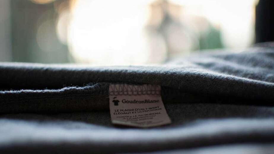
Private label branding — putting your company name inside the collar on a woven label, replacing the manufacturer’s label entirely — is a technique used by fashion brands to signal quality and craftsmanship. It gives the shirt a genuinely branded feel without any visible external logo at all. The employee knows it is their company’s shirt. Anyone who borrows it or notices it up close will find the label. But from the outside, it simply looks like a nice shirt.
The philosophy behind all of these approaches is the same: trust that if the shirt is good enough, people will ask about it. And when they ask, your brand gets discussed in a context of genuine quality and appreciation, not passive sighting.
The Limited Edition Idea — Make It Feel Special
One of the most reliable ways to make employees value branded clothing is to make it feel like it cannot be had by everyone. Limited edition design, produced for a specific moment, transforms a company shirt from a generic giveaway into something collectible.
A “Class of 2024” shirt for everyone who joined the company in a given year costs nothing extra to produce but creates a powerful sense of cohort identity. New hires who wear it are signalling membership of something specific — their intake, their year, their generation within the company. That is a fundamentally different relationship with the garment than “everyone who works here has one of these.”
Company anniversaries are an obvious opportunity. A tenth anniversary shirt, designed to mark the milestone with genuine creative investment, is something employees keep and talk about. A twentieth anniversary becomes part of the company’s heritage. Each edition builds on the previous ones and creates a visual history of the organisation that employees who have been there for multiple editions can trace through the shirts they own.
Department or team-specific designs take this further. A shirt made specifically for the engineering team, with a design that reflects their specific culture and inside references, means more to them than a generic company shirt ever could. It says: someone thought about us specifically. That is worth more than any generic branded item.
The Employee-Designed Shirt
If you want employees to feel genuine ownership over branded clothing, involve them in making it. An internal design competition — open to everyone in the company, judged by a panel, with the winner’s design produced as the annual or seasonal shirt — generates engagement, surfaces creative talent, gives the winner a visible and lasting recognition, and produces a shirt that the entire team has a relationship with before it even exists.
The shirt that comes from this process will not look like a promotional item. It will look like something made by a person who works there, for people who work there — which is exactly what it is. That provenance is visible in the design, and it is something employees talk about.
If an internal competition is not practical, involving an external designer who interviews employees as part of their brief produces a similar result. A shirt designed around what people say about working at the company, using the actual language and references of the team, carries that authenticity in its design even if the employees did not draw it themselves.
Colour Choices That People Actually Want to Wear
The colour of the shirt itself matters enormously, and it is one of the most frequently mishandled decisions in corporate apparel. The default is to produce branded shirts in company colours — which makes complete sense from a brand consistency perspective and almost no sense from a wearability perspective.
If your company colours are bright, saturated or unusual, a shirt in those colours is going to be difficult to wear in everyday life. It will not go with much. It will stand out in ways the wearer may not always want. And because the colour is so strongly associated with the brand, wearing it feels even more like walking advertisement than a neutral shirt would.
The alternative is to treat colour as a design decision in its own right. Muted, desaturated versions of your brand colours are significantly more wearable than their full-intensity equivalents. A company whose brand colour is bright red might produce a shirt in a deep burgundy that references the brand palette without replicating it directly. A company with a strong blue brand might use a washed indigo or a slate grey. The connection to the brand is there for people who know it, but the shirt exists on its own terms as a wearable object.
Neutral colours — black, white, navy, stone, olive — will always produce higher wear rates than brand-specific colours, regardless of what the brand colour is. If the goal is maximum wearability and therefore maximum brand exposure, a well-designed shirt in a neutral colour will outperform a logo shirt in a brand colour almost every time.
Why Indirect Branding Works Better Than Direct Branding
All of the approaches described above share a common logic: they lead with the design and let the brand follow, rather than leading with the brand and hoping the design holds up. This is indirect branding, and the evidence for its effectiveness is everywhere in consumer culture.
The most worn branded garments in the world are not the ones with the biggest logos. They are the ones with the most interesting designs that happen to carry a brand. Supreme’s brand recognition was built on a simple box logo applied to genuinely desirable objects — the logo became desirable because the objects were. Carhartt’s workwear is worn by people who have never done manual labour because the design language of utility became fashionable. Band t-shirts from concerts decades ago are more worn today than most contemporary branded merchandise because they captured a moment that meant something to the people there.
The principle is consistent: people wear things that say something about who they are. Design your company’s branded clothing to say something interesting — about your culture, your values, your history, your industry — and employees will wear it because wearing it says something about them. Your logo, present but not dominant, goes everywhere the shirt goes. That is exactly what branding is supposed to do.
A shirt that an employee chooses to wear to a weekend market, a family barbecue or a night out with friends generates brand impressions in environments your marketing will never reach. It starts conversations that no advertisement can start. It signals something genuine about the company because a person who was not obligated to wear it chose to anyway. That choice is the most credible endorsement your brand can receive.
A Short Brief Before You Start
Before briefing a designer or a supplier, it is worth spending twenty minutes answering a few questions honestly. What phrases or references does your team use that nobody outside it would understand? What would you want someone who does not know your company to think when they see one of your employees wearing this shirt? What moment, milestone or aspect of your company’s culture is worth commemorating? If the shirt had no logo on it at all, would someone still want to wear it?
The answers to these questions are the brief. A supplier or designer who can work from that kind of brief — rather than just a logo file and a colour reference — will produce something categorically different from a standard corporate shirt. It will be something your employees see as a gift rather than a uniform, wear as a choice rather than an obligation, and carry into the world in ways that justify every penny spent on it.
We work with companies across Europe to design and produce branded apparel that employees genuinely want to wear — from typography-led tees to custom illustration hoodies, private label finishing and premium fabrics. From 100 pieces, shipped EU-wide in 10–14 days. Get a Free Quote →